Easy Growth
An E-commerce website which provides an educational platform for students to find appropriate lessons that match their aptitude and which manages their individual study plans.

01 Background
Our client International Academy of Children and Adolescents Development Planning located in China. They asked us to help them develop a new E-commerce website to provide an educational platform for children. This platform would match students to appropriate courses based on their aptitude. Furthermore, it would create a custom-tailored, individual study strategy for each student.
Products and Services:
Step 1: Aptitude test battery
Step 2: Individual study strategy
Step 3: Easy Growth study platform

02 Wireframes
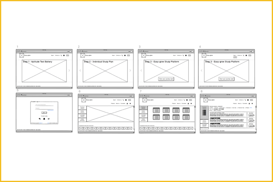
Per the client’s request, I worked on the wireframes to further align the client’s needs with the pages and features.
1. Design an E-commerce Website which includes below pages:
Home Page / Sign-in Page / Product Pages / Check-out Page / Profile Page / Network Page
2. Design above pages to achieve below features:
Sign in / See the products / Add the products to the cart / Finish the products checkout and payment / Rate and review the products / Check and manage the study plan / Share your plans to your network / See the updates of your network

03 User Research
Target:
The millennial parents of children ages 1 to 18.
Key learning:
All parents have the same objective: they want the best possible results for their kids.

04 Style Guide
Brand story:
International Academy of Children and Adolescents Development Planning started in 2016. It uses the most updated assessment system and big data to find a holistic solution for children’s education. It’s mission statement is “Teach students in accordance with their aptitude as a feasible technology”.
Tone and manner:
Growth, Intelligence, Confidence, Trust, Joy, Positivity, Passion

05 Design Iteration
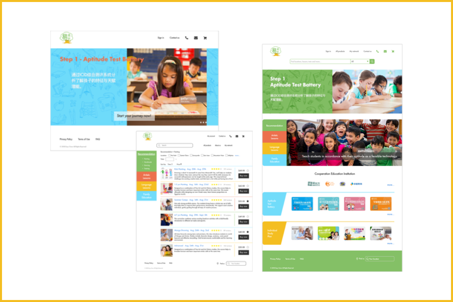
I kept doing user testing on my classmates, clients and the interview subjects who did my user research. I got their feedback and kept iterating improvements:
1. Put the products on the home page.
2. Change the color of the buttons and links.
3. The navigation bar is too small. Make it on one line.
4. Keep each sections consistent, including the buttons and links.
5. Consider making the text color darker, or making the background color darker to increase contrast.

See more details here
